Tlingit Typographic Expressions [ series ]
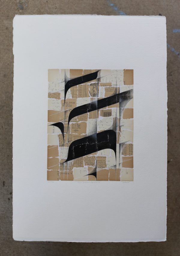
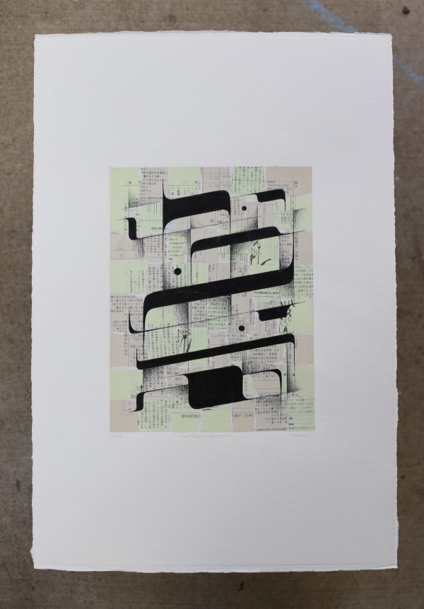
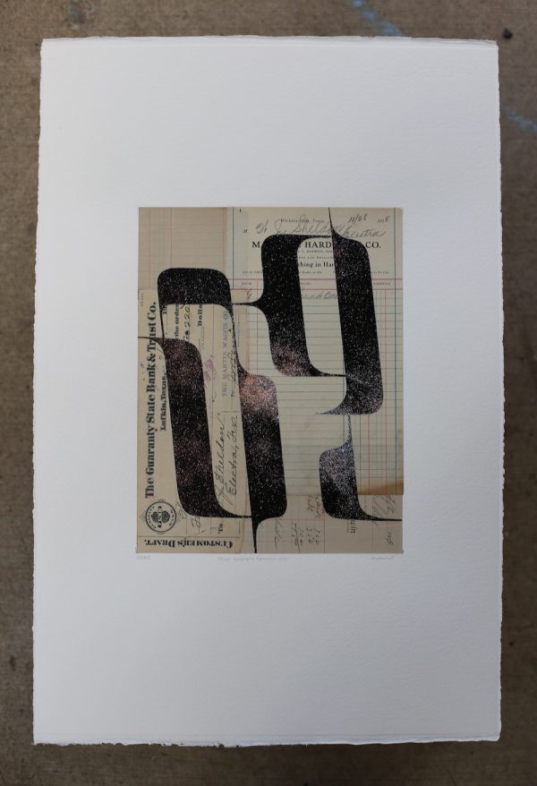
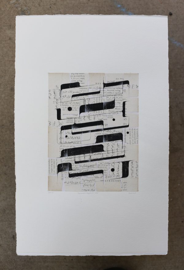
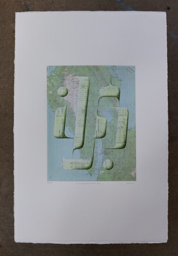
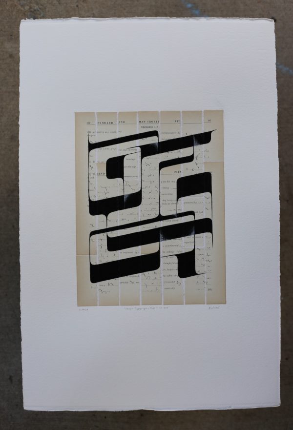
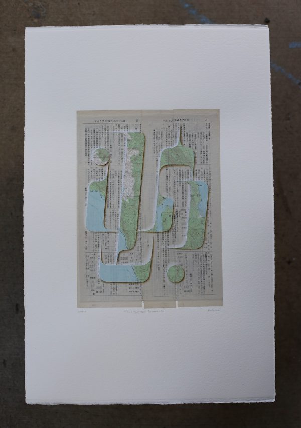
These works depict to the inherent elements of knowing, that we all understand but can’t quite put into words. They speak to the idea that the Tlingit language has been an oral tradition since time immemorial, until the past hundred years — and so, perhaps, this abstract formline moves with the shape of the spoken language.
This series was created to adorn the walls of the Stonington Gallery during Lily and I’s “Two Sisters” show, which opened in September 2022. It was an exploration back into working with papers for me, and their concepts unfolded before my eyes. With this project, I challenged myself to create as freely and thoughtlessly as is possible for my analytical and perfectionist mind. I didn’t want to make anything objective… so I started by exploring my favorite formline shapes. The finished products are a conglomeration of my background.
My mother used to draw formline on scraps of paper for me to trace and color as a child. During my obsession with American Girl Dolls, I’d create button blankets for them to wear, which is when I began drawing formline myself. In junior high, I began exploring the world of typography, with my moderate interest in the subject following me through adult-hood. I have very strong opinions when it comes to Type.
I also really love Xacto knifes. And paper. My parents explored collage within hefty series during my high school years, and welcomed me to experiment with their vintage and Japanese papers. They were guided through the collage process by our good friend Cecil Touchon, who is a prolific collage artist to this day. Over the years, Cecil has shared his theories and advice with me, both spiritual or artistic. His work challenges the value of and emphasis on written language. Because his presence has been a constant in my life, I must attribute much of my “muse” to him. People have commented that this series of work reminds them of my mother’s work, but what they’re really seeing is Cecil’s influence.
Then, you add my recent formal studies of formline with Robert Mills and Steve Brown. During the first five minutes of the first day of class, Robert stated that “formline is the calligraphy of the Northwest Coast people”. And as a former graphic designer, this blew my mind. Typography is very similar to formline. They both have rules, many of which are difficult to explain in words, and would require many chapters to do so right here. Nevertheless, they require an understanding of weight, line and negative space. The shapes and space between are all in relationship with one another, and therefore, even when one begins to work abstractly with formline, a successful cohesive design will have a strong sense of unity.
